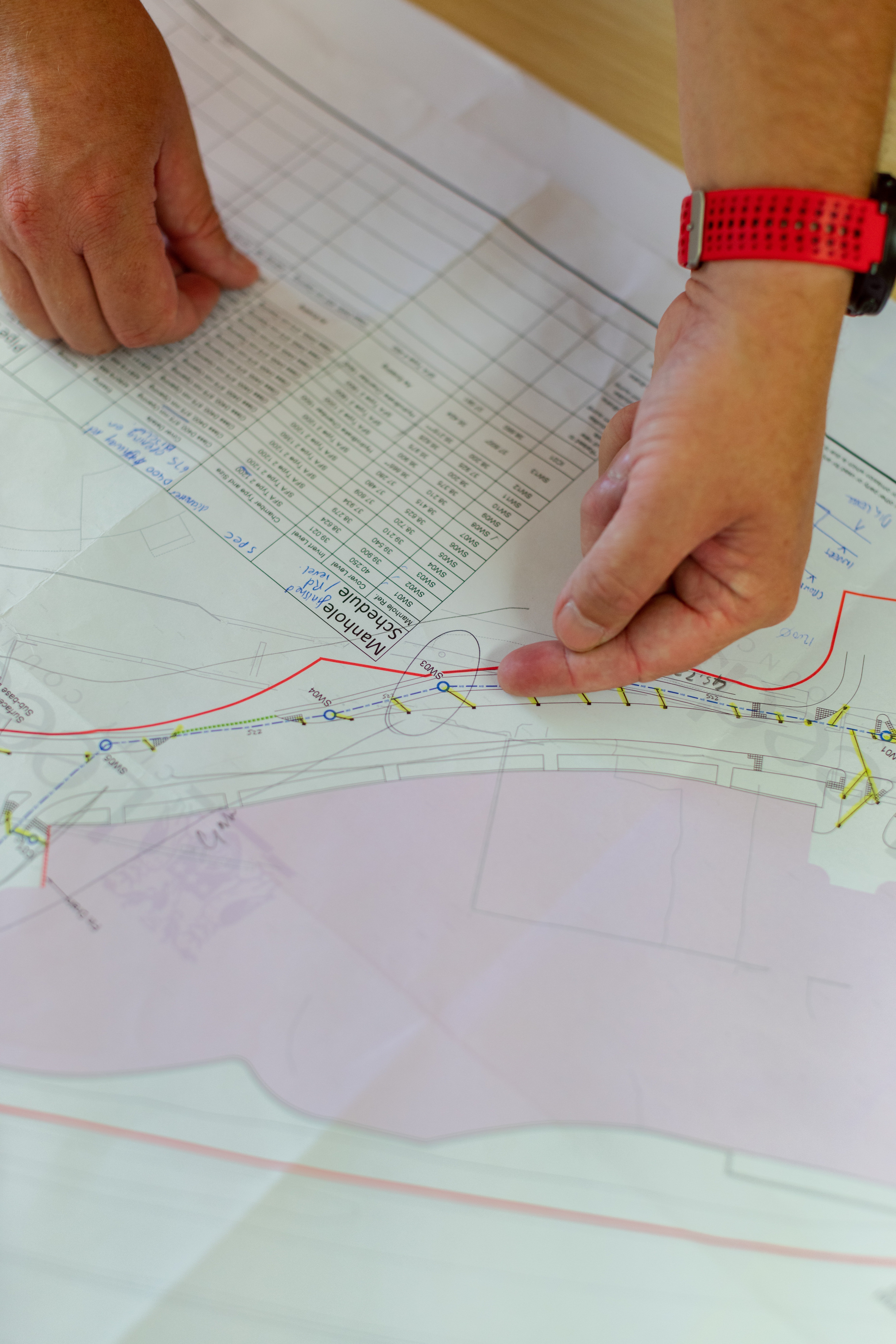
What is Geomatics Engineering?
This animated GIS map visualizes the global progression of electricity access from 1990 to 2022. Using data from the World Bank, the animation showcases how different regions have expanded their electricity infrastructure over time. Each frame represents a year, with countries gradually changing color based on the percentage of the population with access to electricity. Darker shades indicate lower access, primarily seen in regions of sub-Saharan Africa and parts of Asia, while brighter shades reflect higher access in developed countries. The animation highlights significant improvements in energy access worldwide, capturing the global push towards universal electrification. This project serves as a powerful tool for understanding the evolving landscape of energy availability over three decades.